Building Energy Boot Camp 2018 - Day 4

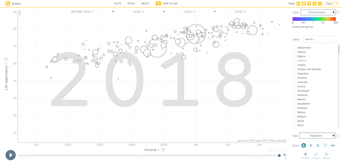
Today we watched a TED talk, How Not to Be Ignorant About the World, by Hans and Ola Rosling. I was not at the meeting, so I watched it remotely. Although it did not apply to programming itself, it did put data analysis in a different light. Also, Hans Rosling is the founder of the Gapminder Foundation, which has many different graphs on its site, all of which are visually pleasing and convey information well. The graph we were given as example, a graph displaying the CO2 emissions of various countries, in metric tons per person, is displayed below:
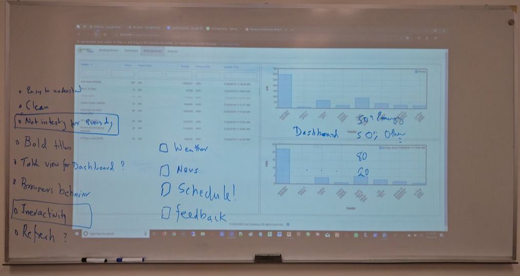
Afterwards, there was a discussion in which ideas for a new dashboard were discussed. As you may recall, our current dashboard (located internally at 10.12.4.98:81/?page=dashboard) doesn’t have too many features. We want the new dashboard to be interesting, informative, and interactive.
After those who were at the boot camp had lunch, a project was assigned in which we were given the choice to either make a simple display with data about the air in certain wings of the high school, or to make a gauge that could tell you how good or bad a certain value was. We were shown the following images to get ideas:
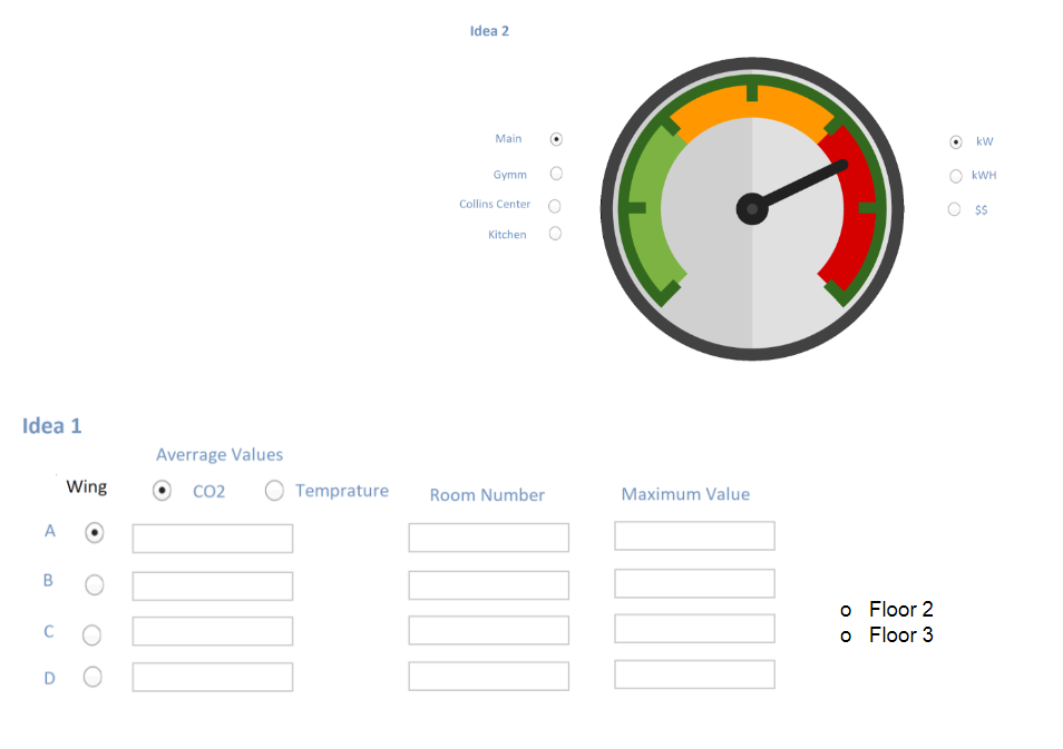
As you can see, the gauge project has more GUI in it, but it displays less information. The display, however, has much less GUI but displays much more information. I like how it makes a kind of balance between the styles of the projects. I can’t wait to get started on it.