Building Energy Boot Camp 2019 - Day 2

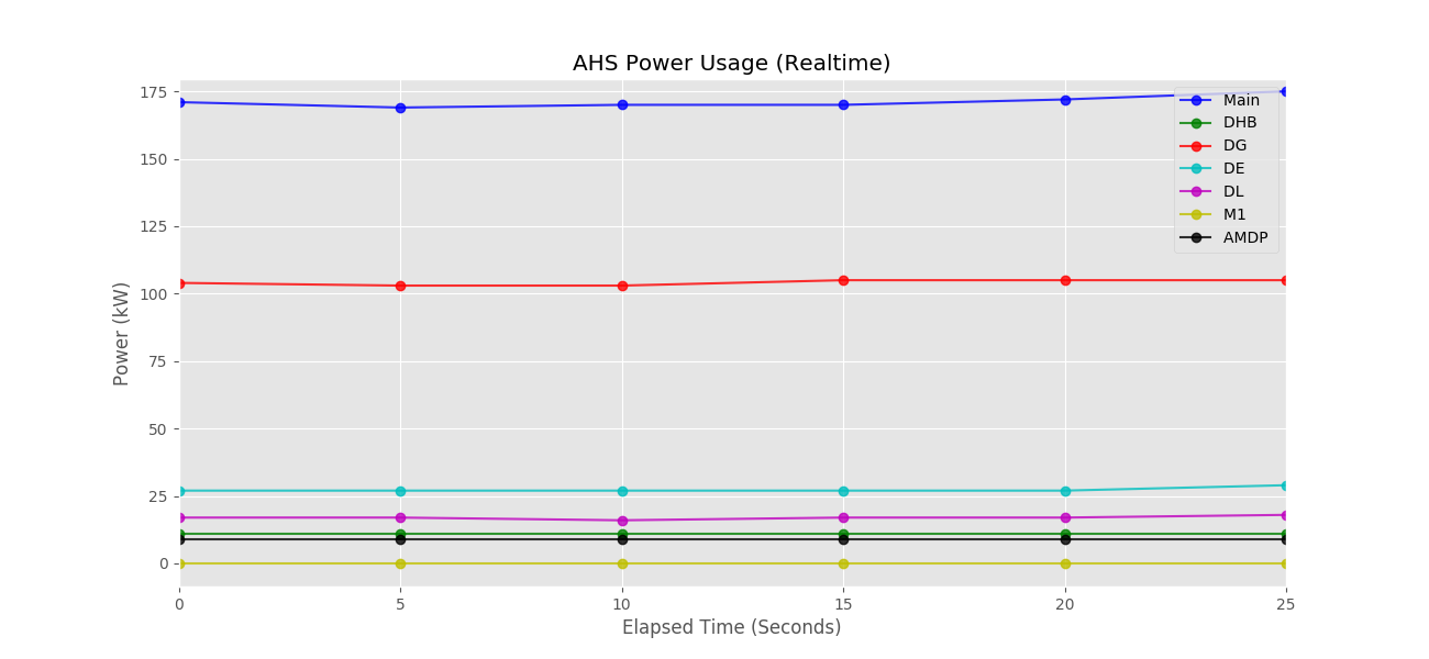
Today, we expanded upon our work with matplotlib to improve our line graphs. We did so by reading an article called Real-Time Graphing in Python by Joshua Hrisko. From this article, we learned a method of scrolling our graphs horizontally by shifting the elements in a list of x-coordinates. We utilized a library made by the author, pylive, to make our graphs better, both in terms of performance and visual appeal. I spent many hours working to expand the code from my previous post to not only work with pylive, but to also display a different line for each of the 7 sensors in the CSV file simultaneously and in the same graph (see Code and Output for a screenshot of the final result. I was ultimately successful, but the graph would take a long time to update due to the one request per second limit on the BACnet network. I ended the day by making plans for a multi-threaded, data-storing system that would continuously pull new data and store it in a pandas dataframe, following the suggestions of Mr. Navkal, the Energize Andover Lead. I plan to transform this project to include to programs, one (as previously described) that would show live data pulled continuously in the background and stored in a dataframe and export this data to a CSV file or database when closed, and one that would simply plot an interactive graph from such CSV data. The two of these programs, in combination, will allow any user to see both live and past data easily and quickly. I plan to continue my work towards this goal as the week goes on.
Code and Output
The code used to achieve this output:
import numpy as np
import pandas as pd
import os
import numbers
from BuildingEnergyAPI.building_data_requests_internal import get_value
from pylive.pylive import live_plotter_init, live_plotter_xy

# Open dataframe
df = pd.read_csv(os.path.join('csv', 'ahs_power.csv'))

# The most points to be shown on the screen at one time
max_points = 20

# How many seconds between updates
update_interval = 5

# How many lines to use (number of rows in df)
num_lines = len(df.index)

# Generate num_lines x max_points empty arrays
x_vec = [[0 for zero_counter in range(max_points)] for array_counter in range(num_lines)]
y_vec = [[0 for zero_counter in range(max_points)] for array_counter in range(num_lines)]

# Convert to nd_arrays
x_vec = np.array(x_vec)
y_vec = np.array(y_vec)


def get_readings():
    values = []

    for row_num in range(num_lines):
        value, units = get_value(df.loc[row_num]['Facility'], df.loc[row_num]['Meter'], live=True)
        value = float(value) if isinstance(value, numbers.Number) else ''
        values.append(value)

    return values


# Supply first values
first_values = get_readings()

for index in range(num_lines):
    y_vec[index][0] = first_values[index]

lines = [[] for line_num in range(num_lines)]

color_options = ['b', 'g', 'r', 'c', 'm', 'y', 'k', 'w']

# Cycle through every color in the order shown in color_options
formats = ['{0}-o'.format(color_options[format_num % len(color_options)]) for format_num in range(num_lines)]

# Pull Labels
labels = [row['Label'] for index, row in df.iterrows()]
labels = [item.replace('(kW)', '') for item in labels]

live_plotter_init(x_vec, y_vec, lines, formats, labels, title="AHS Power Usage (Realtime)", xlabel='Elapsed Time (Seconds)',
                  ylabel='Power (kW)')

# The index to replace
coordinate_index = 1

while True:
    live_plotter_xy(x_vec, y_vec, lines, coordinate_index, pause_time=update_interval)

    values = get_readings()

    for x_arr in x_vec:
        x_arr[coordinate_index] = x_arr[coordinate_index - 1] + update_interval

    for index in range(num_lines):
        y_vec[index][coordinate_index] = values[index]

    coordinate_index = coordinate_index + 1

    if coordinate_index == num_lines:
        coordinate_index = 0
import matplotlib.pyplot as plt
import numpy as np

# use ggplot style for more sophisticated visuals
plt.style.use('ggplot')


def live_plotter(x_vec, y1_data, line1, identifier='', pause_time=0.1):
    if line1 == []:
        # this is the call to matplotlib that allows dynamic plotting
        plt.ion()
        fig = plt.figure(figsize=(13, 6))
        ax = fig.add_subplot(111)
        # create a variable for the line so we can later update it
        line1, = ax.plot(x_vec, y1_data, '-o', alpha=0.8)
        # update plot label/title
        plt.ylabel('Y Label')
        plt.title('Title: {}'.format(identifier))
        plt.show()

    # after the figure, axis, and line are created, we only need to update the y-data
    line1.set_ydata(y1_data)
    # adjust limits if new data goes beyond bounds
    if np.min(y1_data) <= line1.axes.get_ylim()[0] or np.max(y1_data) >= line1.axes.get_ylim()[1]:
        plt.ylim([np.min(y1_data) - np.std(y1_data), np.max(y1_data) + np.std(y1_data)])
    # this pauses the data so the figure/axis can catch up - the amount of pause can be altered above
    plt.pause(pause_time)

    # return line so we can update it again in the next iteration
    return line1


def live_plotter_init(x_vec, y_vec, lines, formats, labels, xlabel='X Label', ylabel='Y Label', title='Title'):
    plt.ion()
    fig = plt.figure(figsize=(13, 6))
    ax = fig.add_subplot(111)

    # Only plot the first points
    for index in range(len(lines)):
        lines[index] = ax.plot(x_vec[index][:1], y_vec[index][:1], formats[index], alpha=0.8, label=labels[index])

    ax.legend()
    plt.xlabel(xlabel)
    plt.ylabel(ylabel)
    plt.title(title)
    plt.show()


# the function below is for updating both x and y values (great for updating dates on the x-axis)
def live_plotter_xy(x_vec, y_vec, lines, stop_index, pause_time=0.01):
    for index in range(len(lines)):
        lines[index][0].set_data(x_vec[index][:stop_index], y_vec[index][:stop_index])
        plt.xlim(np.min(x_vec[index][:stop_index]), np.max(x_vec[index][:stop_index]))
        if np.min(y_vec[index][:stop_index]) <= lines[index][0].axes.get_ylim()[0] or np.max(y_vec[index][:stop_index]) >= lines[index][0].axes.get_ylim()[1]:
            plt.ylim([np.min(y_vec[index][:stop_index]) - np.std(y_vec[index][:stop_index]), np.max(y_vec[index][:stop_index]) + np.std(y_vec[index][:stop_index])])

    plt.pause(pause_time)